

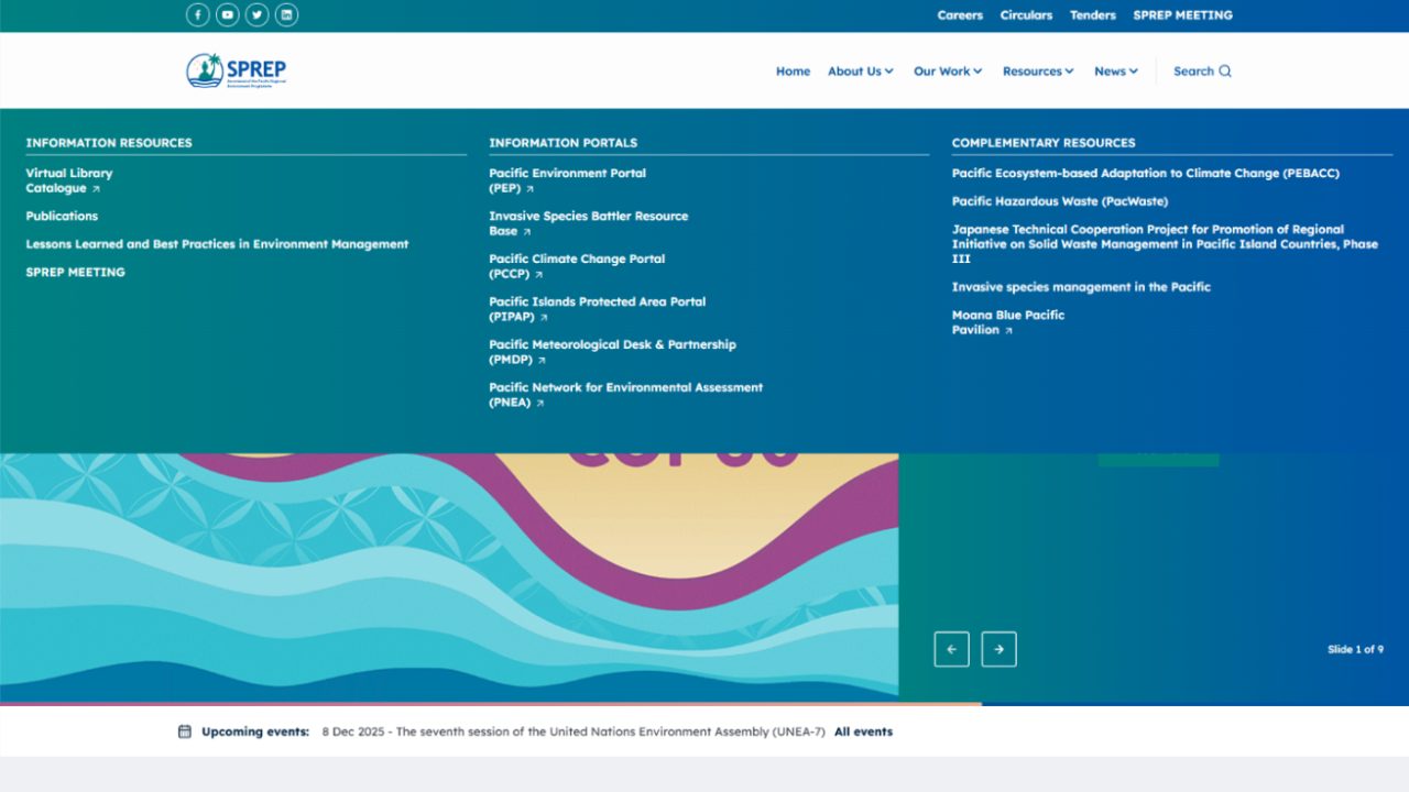
An interface fails in the places a polished mockup never shows: a title that runs to three lines, an empty list, an error, a table with four hundred rows. We design against real content and real states, for public sites, member portals and enterprise admin tools, and hand the result over as a component system developers can build from. On sprep.org, where a large body of resources was hard to find, the menu below groups it into information resources, portals and complementary resources.
Who this is for
- The product works, but people struggle with it. Support requests pile up around the same screens, or staff keep a spreadsheet beside the system because the system is slower.
- The interface is the product. Admin tools, booking flows and portals that people use all day, where every extra step is paid for many times over.
- Several sites or products that should feel like one. A shared set of tokens and components, so each new site starts from the same parts instead of a new set of screens.
- Design only, for another team to build. Files and a component system handed over in a form developers who were not in the project can build from.
If your site needs a new look and a new theme on content that is still sound, that is a Drupal website redesign, where the design, the theme and the launch run as one project.
What you get from a design engagement
- User research on the tasks that matter, with the people who do them
- A design system, not a set of one-off screens: colour and type tokens, components and templates
- Real states designed: empty, loading, error, overflow
- Responsive behaviour specified rather than assumed
- Accessible colour, contrast and focus handling, checked while the palette is still a choice
- Design files in Figma with the component library and tokens
- If we build it too: a front end in SCSS and Twig on Bootstrap 5 that matches what was drawn
Each component is handed over with its states and the tokens it uses, so a developer never has to guess what the empty or broken version looks like.
Sample Component specification: document card Resource library · example.org
| State | What the reader sees | Tokens and checks |
|---|---|---|
| Default | Title, document type, date and file size; the whole card is one link | text.primary #1F2937 on white, 14.7:1 |
| Empty | No document matches the filter: a line saying so, and a button that clears the filter | text.muted #4B5563 on white, 7.6:1 |
| Loading | Grey blocks the size of a real card, so the list does not jump when results arrive | surface.skeleton #E5E7EB, decorative; screen readers hear "Loading documents" once |
| Error | The list did not load: what happened, and a retry button that keeps the filter | status.error #B91C1C on white, 6.5:1, with an icon so colour is not the only signal |
| Overflow | A title longer than three lines is cut after the third; the full title stays in the markup for screen readers | type.title 18/26 and type.body 16/24, tested on the longest real title |
| Focus | A ring around the whole card when it is reached by keyboard | focus.ring #1D4ED8, 6.7:1 against white, where 3:1 is required |
| Rejected token Dates | Light grey proposed for the date line | #9CA3AF on white is 2.5:1 and fails for text; replaced by text.subtle #6B7280, 4.8:1 |
An engineer reads it and replies within one business day.
How a design engagement runs
Design here answers a structural question before it chooses a look. Wireframes come before visuals, so the journey is settled while it is still cheap to change, and the visual work is built as a system your developers can implement consistently.
How a UI/UX design engagement runs
- Discovery What each screen is for, who uses it and what they are trying to finish. Output: the research notes
- Prototype Wireframes, then a clickable prototype on real content, before you sign, taken through feedback until it holds. Output: the prototype
- Fixed price Quoted against the agreed list of templates and components, not a page count. You keep the component list
- Build The design system and the screens, and the front end itself if we implement it. You keep the Figma files
- Acceptance Reviewed with the people who will use it, on real content and real states. You keep the review notes
- Warranty When we also build the front end, defects in it are fixed by the team that built it. You keep the handover pack
Where interface work usually goes wrong
| Failure | What happens | What we do instead |
|---|---|---|
| Designed on placeholder text | The calm layout collapses the day real titles and product names arrive | Design on your real content, the longest and the emptiest cases included |
| Only the happy path | Developers invent the empty, loading and error screens under deadline | Every component drawn in each of its states |
| A folder of screens | The same button in several sizes, and the inconsistency moves into code | A component system with tokens, so each thing is designed once |
| Accessibility left to the build | Colour pairs that fail contrast and focus that is never drawn | Contrast, focus and target size checked in design |
| Handover as flat images | Developers measure by eye and the product drifts from the design | Figma components and tokens that map to the code |
Interfaces we have designed
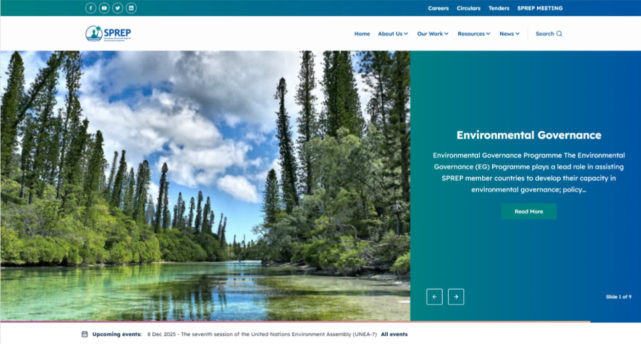
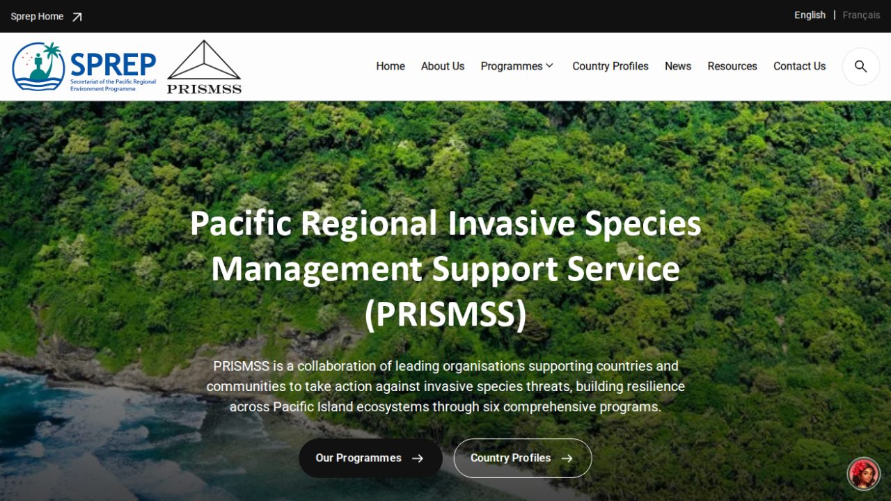
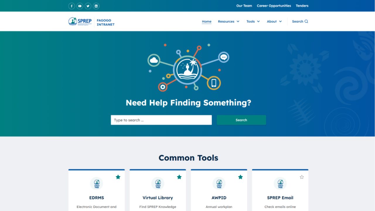
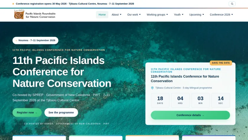
One base, several audiences. PRISMSS, the Pacific NbS Resource Hub and the Fagogo staff intranet were each built from the base of sprep.org and designed for a different audience: a regional service in English and French, a resource library with member accounts, and a workspace for staff. We designed and built each of them, and we maintain them today.
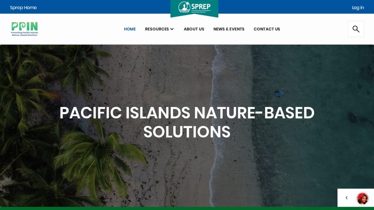
The project manager of the Pacific NbS Resource Hub, on the design and build:
The Weebpal team are awesome and easy to work with. They have made the design and development of the "Pacific NbS Resource Hub" a breeze and they are quick, efficient and I am really happy with the quality of their work and I highly recommend them.
What UI/UX design costs
Design is scoped from the list of distinct templates and components, not from a page count: many pages built from a small set of templates is a small job. We agree that list with you, then fix the price against it. Implementation is quoted separately, and you are free to take the files elsewhere. The rate for a UI/UX designer and the project sizes a build falls into are both on the pricing page.
Terms that hold
These terms hold across our services; where a service starts differently, its page says how. The full wording is on the warranty page and in why you own the source code.
- A prototype before you sign a build Before a build project is signed, we build a prototype at no charge: a design, a clickable prototype or a working demo on real code, so you decide against something real.
- You receive the system and its source code Custom work is yours from the first commit: the repository, custom modules, theme and deployment configuration. When we build your system on one of our platforms, you receive the whole system and its source code as well.
- A warranty on development work Development projects carry a 1-year warranty by default, up to 3 years. It covers defects in what we built, and applying the security releases of Drupal core and contributed modules while the warranty runs. Maintenance picks up where the warranty leaves off.
- Response targets we publish A first response in 4 hours for critical issues, 1 business day for high priority and 3 business days for normal. Support runs in business hours; cover outside them is an option, priced separately.
Questions we get asked
Do you design without building?
Yes. The design is handed over as a component system with tokens, in a form developers who were not in the project can build from, and you are free to take it to another team.
How do we know it will work for the people using it?
By designing against real content and real states, and by putting a prototype in front of the people who will use it rather than approving pictures. A mockup hides the situations where interfaces fail.
What do you hand over at the end of design?
Figma files with the component library and the tokens for colour, type and spacing, every component in each of its states, responsive behaviour written down, and notes on the decisions a developer would otherwise have to guess.
Will it match our brand?
It should extend the brand rather than replace it. If the brand has no digital system yet, building one is part of the work.
Is accessibility part of the design?
Yes, and it is cheaper here than anywhere else. Contrast, focus and target size are design decisions; leaving them to the build means paying developers to undo choices already made.
Does design-only work carry a warranty?
The warranty covers development projects. When we also build the front end, defects in it are covered like any other build; design files handed to another team are reviewed and accepted with you instead.
Not covered here? Ask us directly.
Show us the screenAn engineer reads it and replies within one business day.
Build
Related services
- Custom Drupal Development
- Enterprise Website Development
- Custom Web Application Development
- Software Product Development
- Drupal Intranet and Portal Development
- Drupal Website Redesign and Theme Rebuild
- Drupal Multisite and Site Families
- Drupal Commerce Development
- Headless and Decoupled Drupal
- Drupal Module Development and Porting
- AI Development for Drupal and Web Platforms
- Outsource Drupal Development
Show us the screen that is not working
Send the URL or a screenshot and tell us who is struggling with it. We will say whether this is a design problem or a content-model problem before quoting anything.
An engineer reads it and replies within one business day.