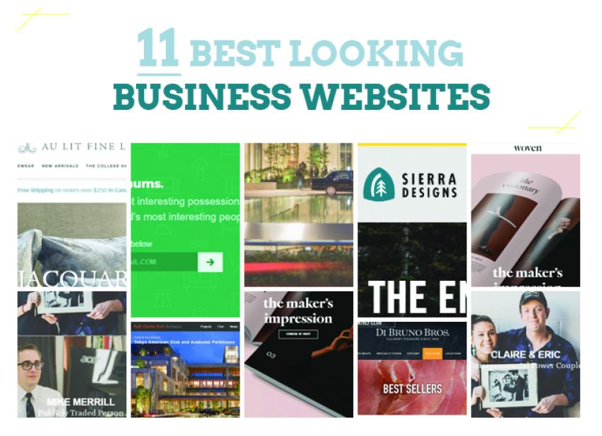
11 Best Looking Business Websites
A great website can add a lot of benefits to your business. Here are a few reasons why: - When people visit your company website, your presentation signals a level of trust in them. A professional gives an overall impression of a trustworthy and reliable company; therefore, people will be more likely to buy your products. - A beautiful and creative website creates a delightful visiting experience and makes people want to return for another visit. As a person working for a technology company, I notice how a simple thing like website presentation can be overlooked and considered as unimportant compared to many other corporate tasks. People don’t realize presentation DOES matter. Website presentation increases the average time that a user spends on your site, their level of trust and their possibility to buy your product. After all, people don’t have the patience to hang around an ugly website for too long. If you need some references to what can be called a great business website to show your web designer, here I have a few for you.
1. Minimums (http://minimums.com/)
Here is a website with absolutely interesting content and communicates with simplicity and confidence. The website design is grid-based and uses bid typography and full-width, high-quality images. What I love about this website is that unlike other sites who try to bombard us with information, it only displays the most important content that we actually want to read. Also, the overall use of colors and visual images is nice and relaxing to look at.
2. The Woven Magazine (http://wovenmagazine.com/)
The Woven Magazine is an online platform to celebrate artists, craftsmen, and makers alike to share their stories of fear and triumph, risk, and return. The website has a very structural layout and an effective use of images and text that don’t distract visitors from the most important content. The website also makes use of blank space to allow web visitors to breath. With no distraction or annoying advertisements, this is the go-to website to immerse only in the content.
3. JOHO’s Bean (http://www.johos.at/#/en/0/0)
Another great business website belongs to JOHO’s Bean. This site mainly focusses on story-telling and is very interactive with visitors. All you need is to “put on your headphones and start scrolling” and the content will take you through the journey of a coffee bean. The sound engineering, imagery, and content all combine to create an interesting and quite emotional experience. The visual images are also beautiful and “speaks a thousand words”. The website homepage doesn’t have too many elements and only focus on the most important content. This reflects the company’s strong intention of making visitors interested in the process of making JOHO’s coffee and lead them to the order stage at the end.
4. ETQ (http://www.etq-amsterdam.com/)
A brand that produces footwear and accessories that live up to its three standard rule: timeless, elegant and quality. Like other great corporate websites, this site also takes the minimalistic approach. “There is beauty in simplicity”, they say. And this website is surely beautiful. Simple, flat, color-based background and big, cool visual images make the most important things stand out: shoes. In addition to this, a lot of the products are displayed on the homepage, which means users don’t need to navigate to another part of the website to look for what they want.
5. Au Lit Fine Linens (https://www.aulitfinelinens.com/)
A website whose aesthetics communicates volumes about the elegance of its products. The boutique was first opened in Montreal and revolves around producing collections of linens. Today, the visual images of the products are very tasteful and luxurious, which showcase the products the business is selling really well. The content is also very selective and only communicates information that matters to customers. The use of gray and white background makes the website very elegant and beautiful to look at. The use of blank space on the website creates an overall relaxing feeling to look at and does not make visitors overwhelmed with the density of the content. Remember that blank space is very important in web design. Blank space equals room to breathe.
6. Hotel Tonight (https://www.hoteltonight.com/)
Hotel Tonight is an app for booking last minute hotel rooms. The landing page of the app creates a very somber feeling with a dark background. The photos are great and somewhat touchy and inspire you to go on an adventure to those places they depict.
7. Exposure (https://exposure.co/)
Another great looking business website we can learn from. Exposure is a platform for your photography and a home for your adventure and stories. The website design is simple and focusses mainly on photos. The white space and clean sans serif typography also make the website very clear to read and comfortable to look at.
8. Pelli Clark Pelli Architects (http://pcparch.com/)
Pelli Clark Pelli Architects is an architectural firm who has received critical acclaim and hundreds of design awards for their numerous projects including retail and mixed-use projects, academic buildings, libraries, museums, research centers, residences and master plans. The business website showcases great photos of their projects, announcing a clear identity about their business to visitors. Black background and big, cool visual images make the most important thing stand out: the architecture. The website hierarchy is also simple and makes it easy to navigate between menus. Finally, one characteristic that the Pelli Clark Pelli Architects website has in common with other websites is the simple approach of the design, which does not make visitors overwhelmed with many design elements.
9. Dainty Jewell’s (http://daintyjewells.com/)
Dainty Jewell is a brand that is on a mission to provide every woman and girl the opportunity to choose timeless fashions that stay true to her sense of modesty according to the Biblical principles. The overall use of colors such as pink and white stays true to the brand identity and reflects the look that owner of Dainty Jewell wants the website to have. The website showcases the clothing collections with beautiful visuals and the clear design hierarchy makes it easy to navigate between content. Overall, it is a feminine, elegant and fresh website that can inspire many ladies.
10. Sierra Designs (https://sierradesigns.com/)
Sierra Designs is a brand that creates outdoor equipment and apparel driven by function and design to keep you happy. Navigation issues on desktop and the disjointed user experience on mobile drove the company to redesign their e-commerce website. The new website has clean aesthetic, lifestyle drive photography and is responsive. Thanks to the new website appearance, conversions have a positive effect on conversion and the metrics are up year over year.
11. Di Bruno Bros (http://dibruno.com/cured-meats/best-sellers/ )
Culinary Pioneers since 1939. A place to come to for extraordinary food experiences, especially for amazing cheese. Big visual images presented in grids throughout the website show beautiful presentation of food. On the website, visitors can explore the cheeses, cured meats, and the gifting program offered by this company. There is a short description for every product to give customers a preview of what it tastes like and what makes it special to inspire customers. The use of sans serif font and a good amount of white space make the website relaxing to look at. The way the menus at the top are organized also makes it easy for visitors to have an overview of all the content and easily navigate between them. In short, the structural and beautiful design creates an interesting surfing experience that gives visitors exactly what they come here for. The website also has diverse content that gives visitors a sense of discovery. According to Janeane Tolomeo – Marketing and Content Manager of the company, the redesign of the website has witnessed a jump in conversion rate and revenue of the company and put the website in the top 100 site list of 2016. In conclusion, the website design plays a very important role in the success of a company. A good website will help your company to appear more trustworthy to potential customers. If you have an ugly website, your content must be very strong to compensate for it. After all, people look for values when they come to your website, not just beauty. However, if the content is not enough to make up for the design, it’s time to redesign the website. That way, your company image will appear more professional to customers and they will have a more enjoyable time surfing your website, more likely to remain on it longer, and buy some of your products!